Deep and dynamic by design
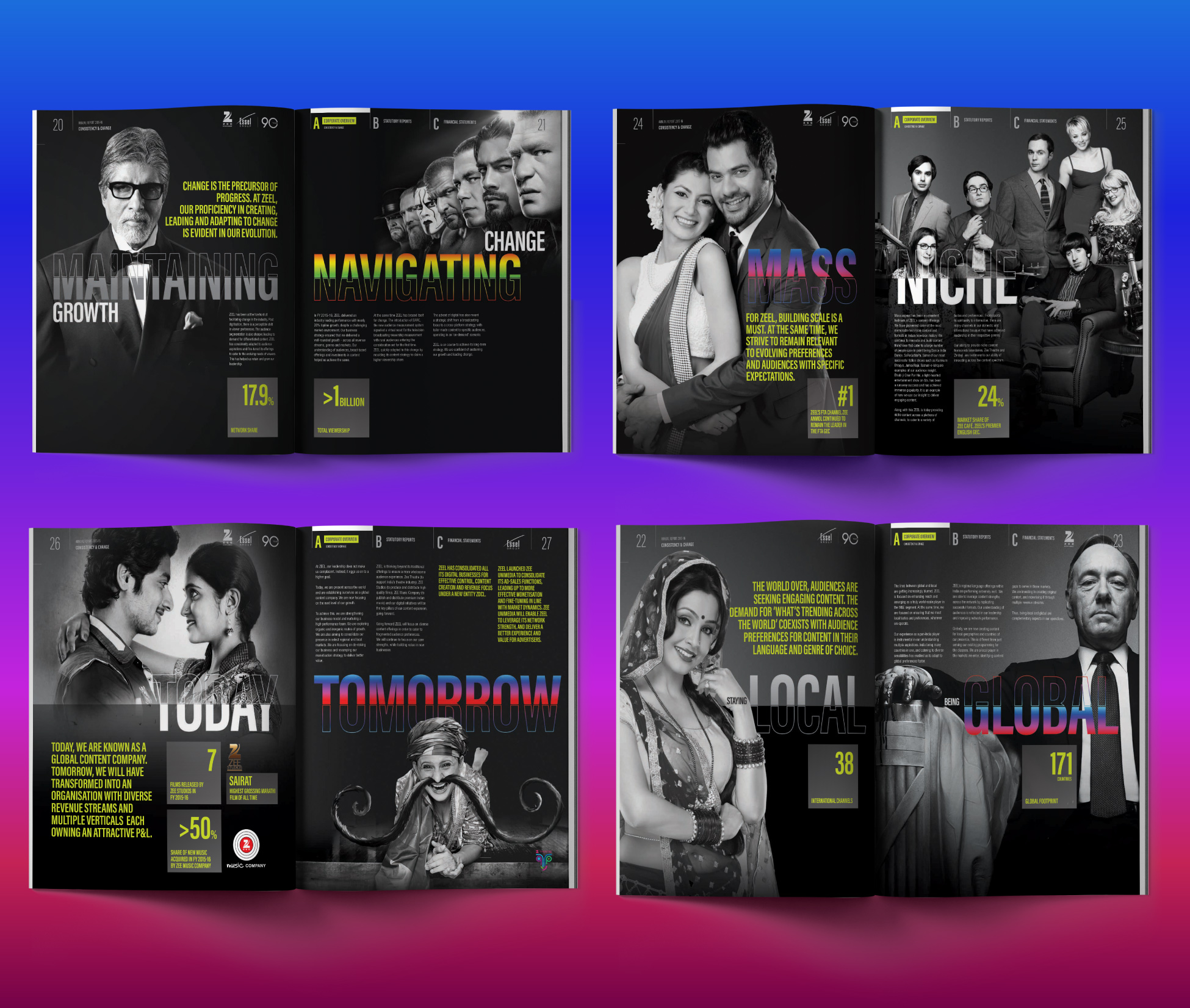
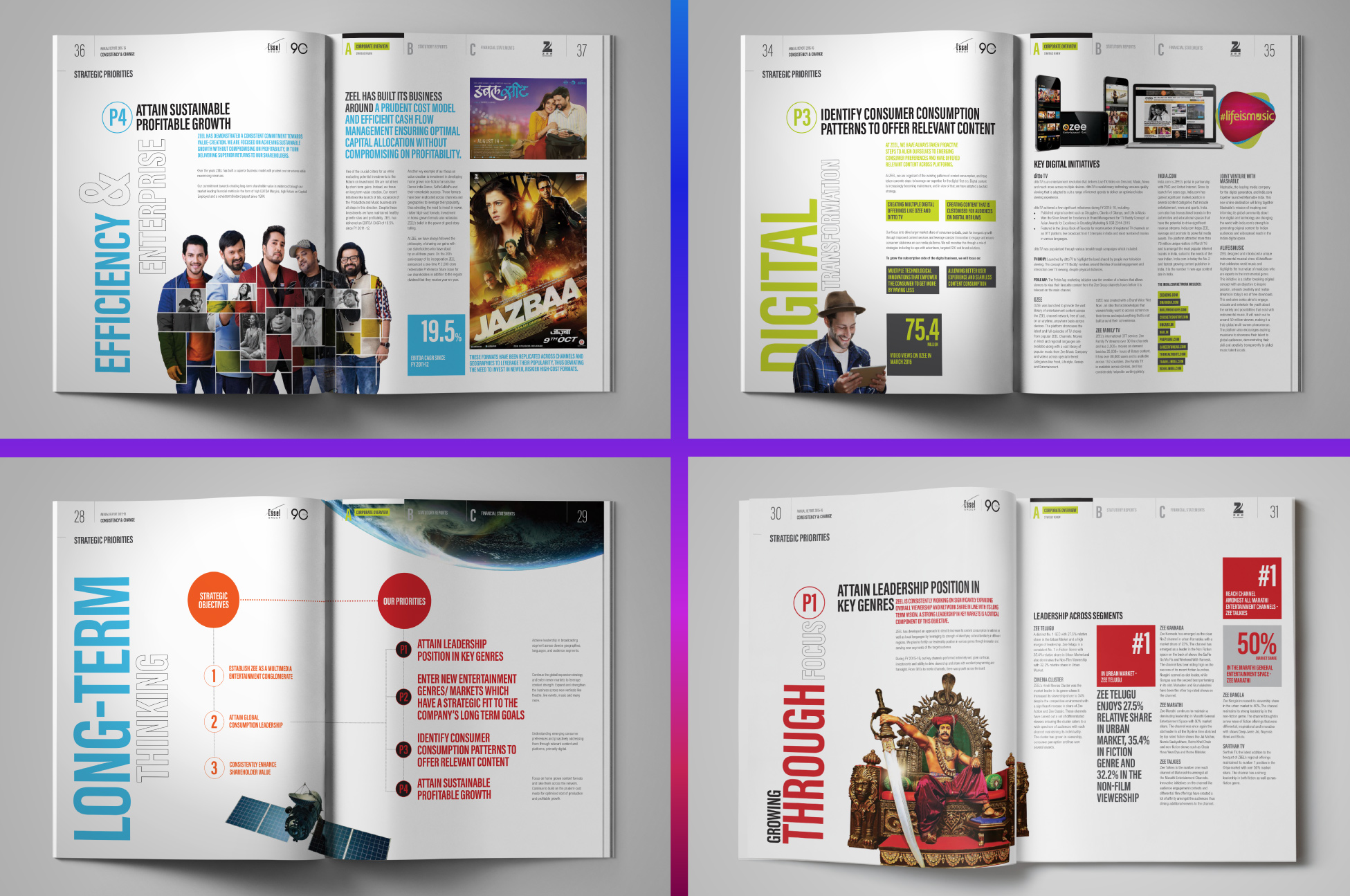
The design was based on a visual twist created using vibrant images from the Company’s TV shows. The typography was created as a unit with a fair bit of overlay and overlap to keep it as interesting as the brand it represented. The outcome was a beautifully designed, classic black cover that provided depth and dynamism to the theme. The insides of the report were a riot of colours and vibrancy, coupled with emotive content, features and narratives on ZEEL’s strategic priorities and overarching theme of growth, change and future.


