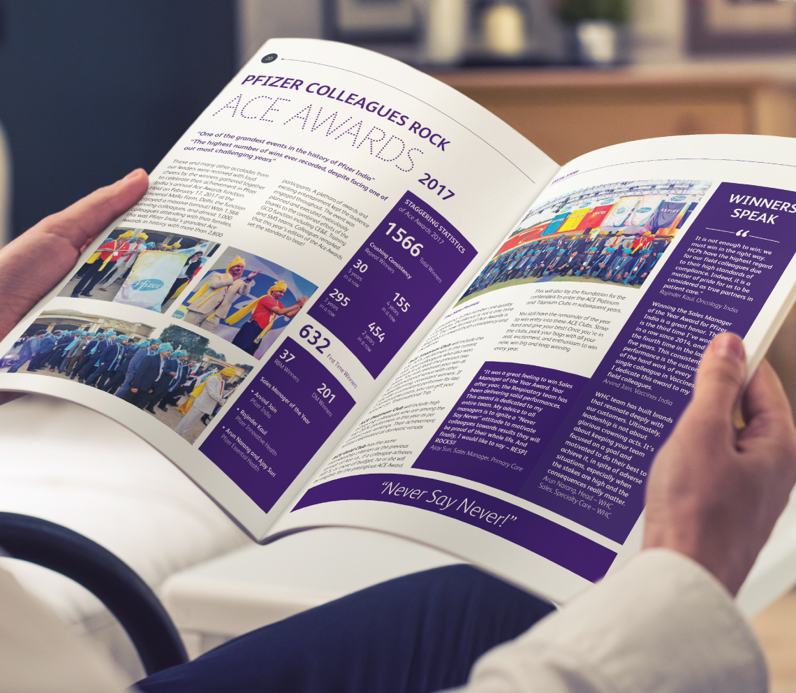
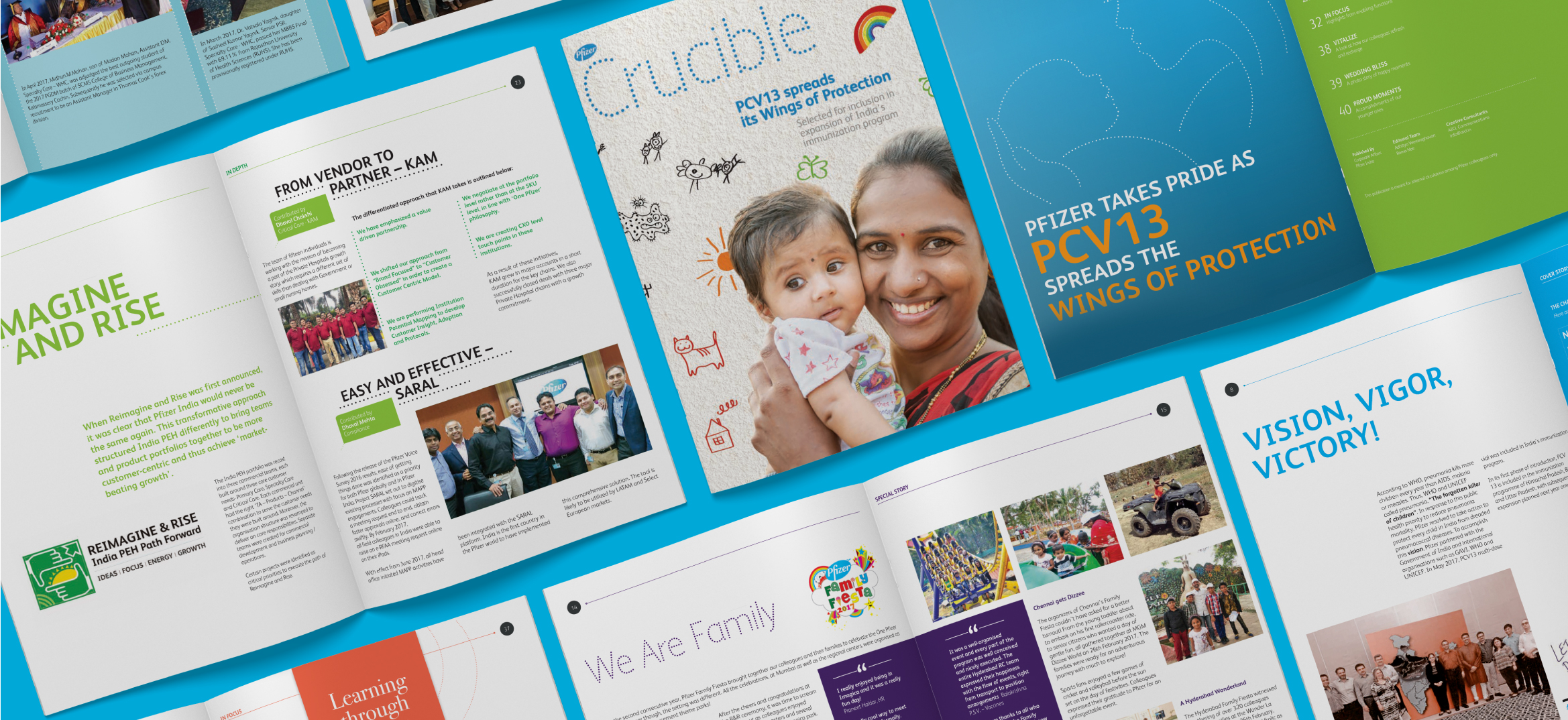
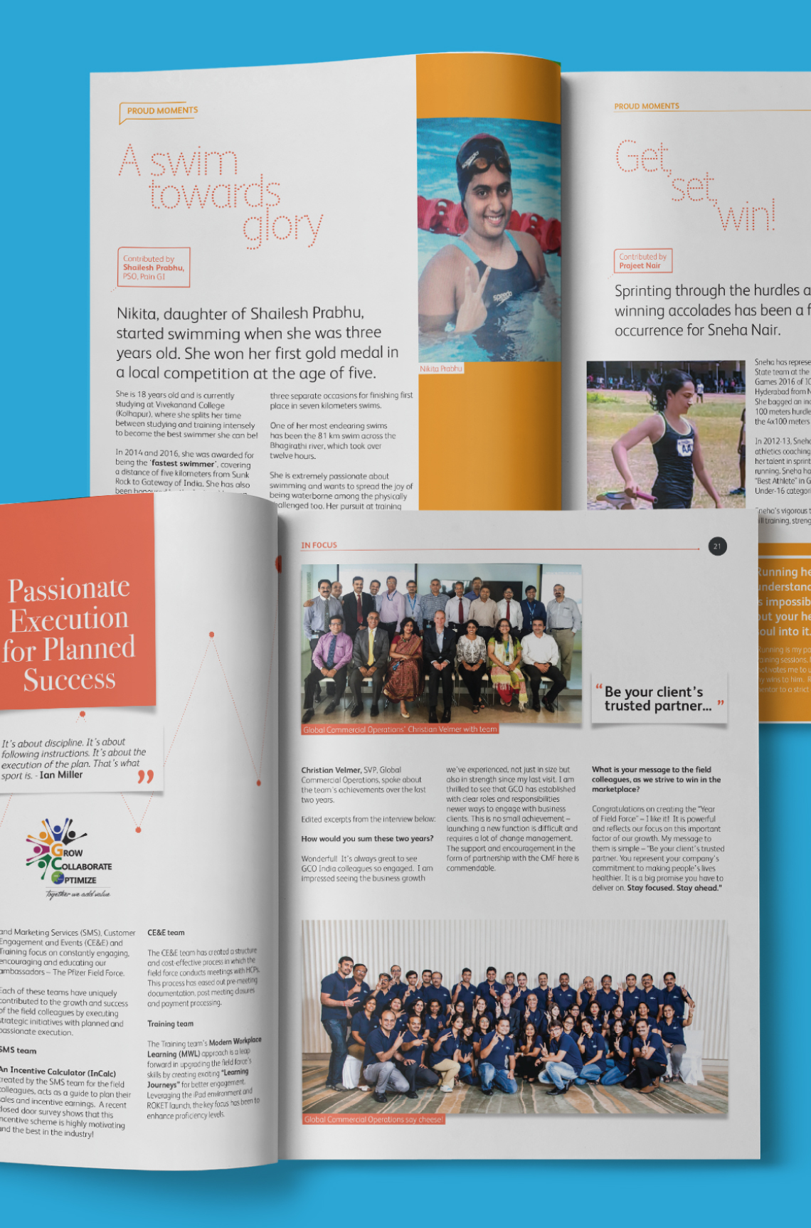
While many rules of the game were set, we managed to create something refreshing and engaging for Crucible, their in-house newsletter. Each section was colour-coded and fleshed out with a specific design language in line with the content. For the 'In focus' section, each article was presented as legend-speak, layouts were treated with a heavy Pfizer Purple colour scheme (suggesting royalty) and text blurbs were presented as historical 'doctrines' or 'code'.
The cover was the result of a creative exercise that involved many of the top leaders of Pfizer India. In a fun photography session, portraits of them holding a blank placard were shot. While designing the composite cover, we imposed the words 'Field Force is Special' on the placards. The idea was to push the message that 'the field force is special', which was wholeheartedly endorsed by all.


